I take my pictures in my living room, preferably during daylight, but it doesn't matter much since not much light reaches my windows in this room anyway. I have managed to take good pictures at night using just my crappy standing lamps. I have two little boys and the nice thing about this is that you can't even tell how messy my house is, since I'm taking pictures up against a wall. Table space is a rare species around here, nearly extinct, so another nice thing is I use a stool, not a table. You do need a digital camera, but it doesn't have to be fancy, a point and shoot will work fine. For this tutorial I also didn't adjust the white balance on my camera in case you can't/don't know how.
What I do have is maybe three yards of cheap bleached muslin, a dowel, two clothes pins, a small length of wire (six inches or so) and two push pins to hold up the clothes pins, a stool, a digital camera and a fabulous FREE! photo editing program you can access on the internet. No download required. Oh, and a pretty product I want to list on my Etsy shop.
I'll divide this into two parts, Taking the Picture, and Editing the Picture.
Part I: Taking the Picture
Expand Post...
My set up is simple. I have a length of cheap, bleached muslin that I draped over a dowel I got at the hardware store and hung that up on the wall. You could tack the muslin to the wall but I found the dowel keeps the fabric from sagging in the middle. In order to keep the dowel up I stuck it in two clothes pins, threaded a small length of wire inside the clothes pin, wrapped the ends together at the top and hung it over a push pin in the wall to keep it up. It sounds complicated but it's not, the picture makes more sense. I also left the photos unedited so you can see just how crappy my lighting is! (Right click when expanding pictures so you don't have to navigate back to the hidden part of the post when you're done.)
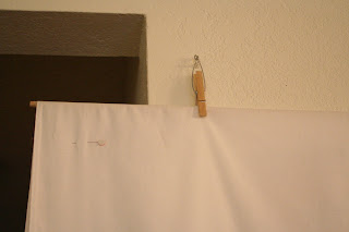
Feel free to hang the dowel however you want - this is what I had in the house! Underneath the fabric is a stool and I draped the bottom of the fabric over it to create a seamless background. Looks like my fabric could use a bit of ironing:
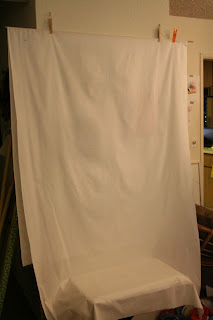
Pretty fancy, huh? Are you drooling with envy yet? No?
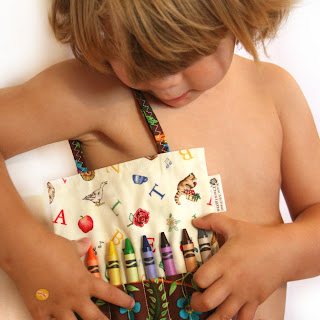
The next step in taking the picture is positioning my item on the stool. Sometimes I prop my item up against the back, sometimes I put one of my kids on the stool to hold it (if it's a children's item), it all depends on the item. I try to think of one thing that might go with it and include that in some of the pictures. I also try to make my initial picture in the listing (the one that gets seen first as a thumbnail) a close-up of some area. I usually don't make the first picture a straight shot of the whole item. Make people want to see more! Here are a few examples:
My Crayon Bag for kids:
A pretty, insulated Pot Holder:
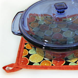
You can't see the whole item, but you can see how it's being used and get a feel for the "character" of the item. Leave your remaining pictures to show the rest of the details - make your first one pop.
The last step is to snap away. The cropping can be done later, but think about the angle while you're shooting. I shot the picture of Noby with the crayon bag at a low level - it's usually a good idea to take pictures of kids down at their level. We have a tendency to stand when taking pictures which usually doesn't work well with kids! For the pot holder I was just high enough so you can see the top and bottom of the pot holder but low enough to get a good angle with the bowl. Don't be afraid to take a whole bunch of pictures! I took 35 pictures of the potholder and ended up with 5 for my listing. I took pictures at a variety of heights and chose the one I liked best after seeing how they looked up close.
I never use a flash. I hate the way it looks and you usually end up with a washed out product with dark shadows behind it unless you have a fancy flash set up, which is the opposite of what we're doing here! You might need to bump up your ISO setting if you're not using a flash. For instance, with an ISO setting of 400 your lens will have to be open longer to get enough light - thus allowing for fuzzy pictures if you have low lighting. With an ISO setting of 1600 your camera will have more sensitivity to light so the lens can be open for a shorter time - thus allowing for a sharper picture if you're indoors. So why not shoot at ISO 1600 for all your pictures? Because your picture will also have more "noise." A good rule of thumb is to shoot at the lowest ISO setting possible for your lighting. I generally shoot at 400 when outside and 800 or 1600 inside. Here's an example of 400 vs 1600 indoors (click it to see it in detail):
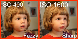
So, there might be a little more grain but it's not a big deal. If you can't adjust your ISO don't worry about it. Use a tripod or put a few more lights in the room. I shot my sample photo for this tutorial at 1600 - I could have gotten away with 800 and had less grain but I didn't think about it.
You're done taking your pictures! When I'm done I put my stool back under the piano, fold the sheet up so the bottom is pinned up by the dowel (that way the front doesn't get dirty and little hands are less likely to pull on it) and I'm just minutes away from taking pictures the next time I need to. It's like a Murphy Bed for photography studios. =)
Load your pictures into your computer and move on to...
Step II: Editing the Picture
This is the part that intimidates people, I think, but it's really not that scary and you don't need an expensive program or fancy editing skills!
I have Photoshop and many people love it but I don't. I even know how to use it and I don't like it. I also have Microsoft Digital Image Pro which is much cheaper (~$60) and does pretty much everything Photoshop does (at least that I know how to do) and that works fine, but there's something out there that's easier, more fun, more user-friendly when saving and re-editing and FREE! People, prepare to have your mind blown: Picnik.com.
Everything we're doing today can be done with the free version of Picnik, which is extensive and fabulous, but the premium version of Picnik is even more fab and I use it, love it and highly recommend it.
So, travel over to Picnik and upload your first photo. I quickly took a picture of Noby wearing one of my bags. I didn't adjust for white balance and it's a little grainy and the composition isn't great - in other words, it's the perfect starting place for this tutorial. A semi-crappy photo! Here's what the screen looks like after uploading a photo:
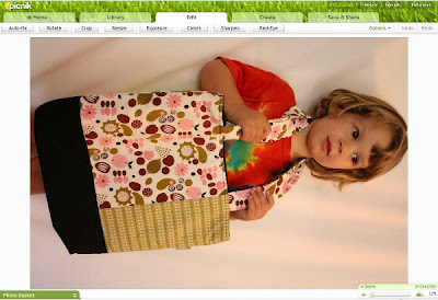
Photo editing, for me, has three essential steps. Rotate: Make your photo upright and straight. Exposure: If you didn't have proper lighting edit the exposure and pretend you did! And finally Colors: If you don't have your white balance set perfectly your whites can look yellow. Bad room lighting can mess things up, too. Make your whites white and you'll have a happy photo.
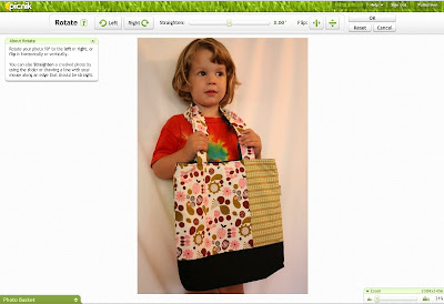
Rotate: Click "Rotate" on the top left, then "Left", then slide the "Straighten" bar if you need to tweak it by less than 90°. Click "OK" when you're done.
Exposure: Then I either do exposure or colors next. Doesn't much matter to me. If I do colors first and then exposure I usually end up needing to go back to colors and tweak things a little further and vice versa. So the next thing we'll do is work on the Exposure. Click "Exposure" then click "Advanced". I don't like adjusting the exposure slider bar since that lightens everything and I don't want my blacks to turn grey. For example, here's the picture with the exposure pushed up:
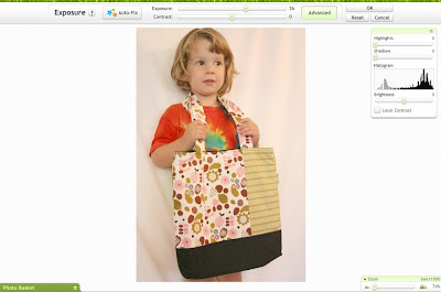
Yuck. The bottom of the bag looks awful and everything is a bit washed out. The key is with the advanced tab. The "Highlights" slider brightens just the light colors, the "Shadows" button darkens the dark colors. That way you can lighten up your image without blowing out your dark colors. Pretty sweet, huh? For this image I'm going to bump my highlights to 21 (it was pretty dark in here), my shadows to 5 (adds in a bit of contrast) and slide the brightness to 13 for a bit of overall lightness. Play around with these settings, get to know them.
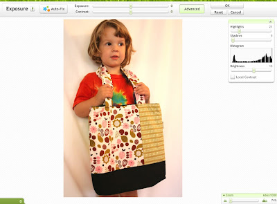
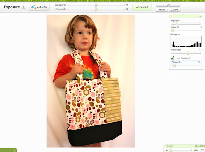
I also clicked "Local Contrast" and raised that just a touch for a bit more contrast. Don't raise this too much or it will look grainy and yucky. Click "OK" to get back to the main screen.
Colors:This is where we're going to adjust the white balance since we didn't do that with the camera. The temperature slider bar is your friend! My crappy room lighting almost always means my pictures are a bit yellow so I always find myself sliding the bar to the left. The left is cool, the right is warm.
I generally find some white on my product and adjust until that white is a true white. Don't worry about the background, we'll end up cropping most of it out, so it's okay if that's not a perfect white. The important thing here is making the product look good.
I like to keep a bit of warmth in my photos, so sometimes, especially if there's a person in the photo, I'll keep it just on the warm side of perfect white. Play around with it, see how you like it. For this photo I slid the temperature bar over to -19. Further and Noby looked washed out, less and the white of the bag wasn't white enough.
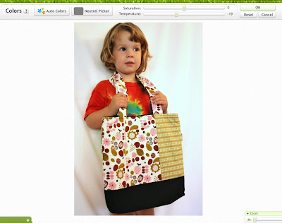
Looking pretty good, huh? We now have a perfectly acceptable picture we could save and upload and be just fine. But let's tweak it a little more, shall we?
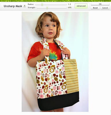
First thing is that it's a bit fuzzy. Click "Sharpen" then "Advanced". The regular "sharpness" slider works fine, but the advanced options give us a bit more control. The "strength" slider determines how much contrast you will have, the "radius" slider essentially determines how far to look for the edges. I think I can't explain that well, let's just look at it.
Slide the "Strength" slider first until you get a good sharpness, then slowly bump the "Radius" slider up until it looks right. Too far and it'll look grainy - try it. Strength at 69% and radius at 1.3 worked for me here:
Now let's crop it. Let's first of all pretend that it's totally natural for this bag to be worn by a 3 year old around his neck. Now I think about my favorite parts of the item, where I want to zoom in, what elements I want to leave in and how the item is used. This bag, for the purpose of this tutorial, is apparently worn by 3 year olds, so let's leave a bit of the 3 year old in it, but not too much, since it's a bit distracting from the bag itself. We'll leave the details on how it's used for a later picture. I love the fabrics together, so I want to focus on that, but I want to leave enough of the item so you can get a feel for its dimensions.
I ended up cropping it to just above his hands - you can see how big the bag is relative to Noby. The bottom is cropped to just above the bottom of the bag - the whole bottom isn't needed, but a glimpse is nice so you can get an idea for how big it is. I wouldn't be afraid of cropping one of the sides out, but I liked how it looked with both sides included.
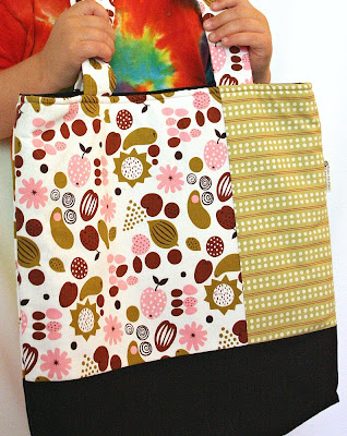
If I was thinking, I would have switched my camera to ISO 800. 1600 was pretty high given that I had some natural light coming in. So it's a little grainier than it could be but it's fine. I also wouldn't put a tie-dye shirt on a model - so distracting! - but it's what he had on and I didn't want to distract him too much so I could write this tutorial in peace!
Click the "Save & Share" tab, give it a name, specify how big you want it (I reduced it down to 1000 pixels tall - perfect for Etsy), I like it to be saved as nice as possible, so I go to 10 on the compression scale (best quality, huge file size) but if you want to save space on your computer save at an 8. Click "Save Photo," navigate to your folder and you're done! One of the lovely things about Picnik is that you can save it directly to Facebook or Flickr or send it off in an email and more! Check out all the options at the top there. Also, with the premium version you can go back to the photo from your handy History tab and pick up editing right where you left off at a later date.
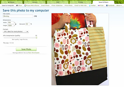
See, it's not that hard. Two main steps - taking the picture and editing the picture. Editing has three essential steps - rotating, adjusting the exposure and adjusting the color. After that we can sharpen if needed and then we crop it to our liking and save it!
Let's see how our before and after pictures compare:
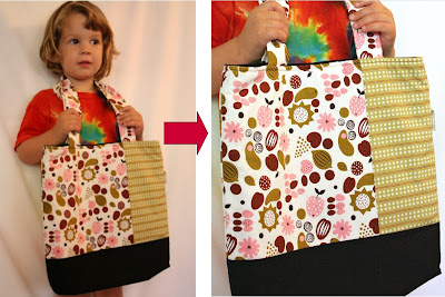
Pretty nice, and no fancy equipment or photography studio needed!
I guess my other tip would be to be consistent. If you usually take pictures of your bracelets on a white background don't suddenly have a listing of one on a black background. My pictures, at least the first pictures in the listing, are all on a white background, usually zoomed in and a hair on the blown-out side of bright. Here's a mix of some of my listing pictures:
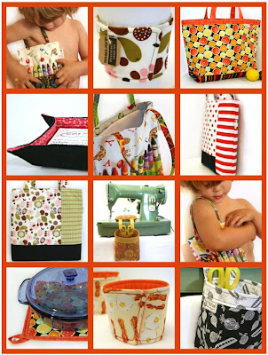
They all have the same feel and look like they all belong in the same shop. (Visit my shop to see all my items currently for sale! katemcfauldesigns.etsy.com)
Stay away from the fancy effects. Don't use special borders - and you're probably not going to get in a treasury if you have your shop name or the fact that your image is copyrighted written across the item.
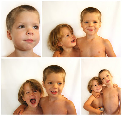
Oh, and I've used my sheet on the wall to get some nice pictures of my boys, too. I think it's written in their bylaws to never sit still EVER, so perching them on a stool helped keep them in one place. =)
My OTHER products:
Thanks for reading and I hope that helped! It's certainly not a comprehensive lesson on all the ways to edit a photo, nor does it include fancy tips and tricks, and if you do it a different way and get better results, great! Leave your tips in the comments! But hopefully with a few yards of muslin and a camera you are now able to take great pictures for your shop.

8 comments:
WOWOW! What a fantastic tutorial!! This must have taken you hours and hours. I use Gimp for photo editing but for my next photo shoot I'm going to print out your tutorial and give picnik a try!! Do you have any advice on where and how to crop photos to a square shape?
Liane (visiting from SFEtsy)
spacestitch@hotmail.com
Thanks! This was definitely one of the more time consuming posts to write. =)
Picnik can do square shapes or 4x6 or 5x7 or 8x10, etc. There's a drop-down menu for choices. Easy peasy!
bee-YOUtiful! This is fantastic! Thank you so much for all this great info. I feel like I have great tools as I go to work on my pics! Yay!
Jen (the Mama in Mama's Magic Studio, fellow SFetsy member)
http://mamasmagicstudio.etsy.com
Wow, great tips! I love Picnik, too, but now realize I'm not using it to its full potential. One question: do you have a rule of thumb for dimensions on you cropped photos? I've been doing mine square, but wonder if that's the best idea, given that thumbnails and gallery views have different dimensions. Or maybe it doesn't matter that much? Thanks.
Angie (another SFetsy member)
http://www.AngieHandmade.Etsy.com
Jen - thanks!
Angie - I crop my photo how I like it to look, but I always keep in mind that it will be 8x10 for the featured photo and square for the listing, so I make sure that however I crop it it looks good in either dimension. Does that help?
Yes, that helps. Thanks so much. I just re-edited a couple of my phots and they look so much better than before. I know they'll get even better with practice.
Angie
I got your tutorial link from a Kendre Renee. I have been using Picasa and from your tutorial Picnik is the one to use.
Thanks so much for your help
Patricia
hotstreets.etsy.com, dlist
As I know better I will do better
Hi! Love your tutorial! Just what I was looking for! Linking to my blog. http://woolyworldneedlefelt.blogspot.com
Thanks for the help!!
Ashley
Wooly World
http://smootynashley.etsy.com
Post a Comment